


.jpg "Get Timeform ratings for every upcoming runner and past result, plus premium winner-finders including commentary, Flags, Pace Maps and lots more.")


 Url copied to clipboard.

Assessment of trainers and jockeys has tended to be done only on the surface, by means of simple strike-rates, alongside individual intuition. But Timeform’s revolutionary Jockey And Trainer Dashboard brings colour and context to analysis like never before, with a depth of data that examines specific strands and styles.
The tailored statistics, powered in part by Timeform’s sophisticated – and updated – run-to-form calculations, are presented via visuals which make certain strengths (and weaknesses) immediately apparent. They come complete with a means test against the ‘average’ amongst the trainer or jockey population where applicable.
MEDIAN RATINGS
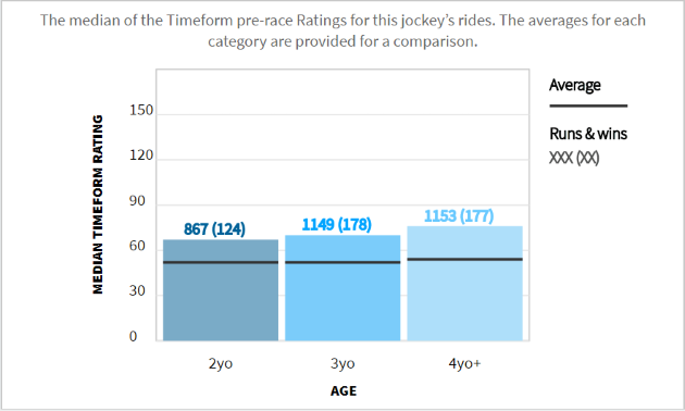
Fundamentally, median ratings reflect strength, both of the string of a stable and the standing of a rider. It’s about supply and demand: median ratings show the quality of a trainer’s supply line, and a jockey’s demand is in some way indicated by the calibre of their mounts, plotted against the line representing the average.
The jockey only rides the horse, but the trainer shapes it, and the median ratings visualisation – split into categories of bumpers, hurdlers and chasers for National Hunt and two-year-olds, three-year-olds and older horses for the Flat – is an even more enlightening tool for assessing the areas of particular strength for any given trainer.
To that end, the filters at the top of the dashboard – for race type and date range – enable you to refine a search to suit your requirements. The built-in layers of the dashboard means you can tailor a study for a specific race, and the data may show a horse in a different light if the jockey or, moreover, the trainer is stronger in the relevant department than others.

Click on any jockey or trainer in a Race Passes racecard view, then on the ‘unlock’ banner to buy premium data for 50p
RIDING STYLE
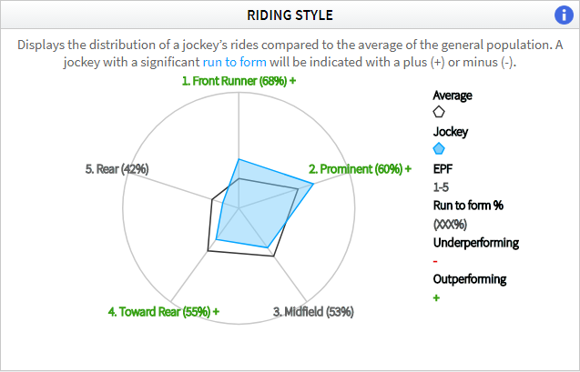
Using data unique to Timeform, the Riding Style Radar takes jockey analytics to a new level. This dashboard instrument performs two functions at once: firstly, as a comparative tool, via the pentagon at the centre of the radar, it summarises the riding behaviour in tactical terms of any given jockey, matched against the ‘norm’ for the whole group, highlighting any differences in apparent strategy. It then goes one step further by assessing the merit of the jockey in each area of style, by means of our run-to-form ratio, colour coded in green (outperforming the average) or red (underperforming) for added clarity.
The calculations are drawn from the EPFs (Early Position Figures) that are digitally inputted by our reporters on every horse in every race, 1 representing the front of a field and 5 at the back, with points in between. That the radar and the EPFs are plugged into each has the extra benefit of identifying which riders are potentially a good fit for the horse when looking at a race. The rider-racehorse relationship is vital to performance but working out one’s suitability to the other, especially with newer connections, has only ever been done by feel or by trawling through a sea of ill-fitting statistics, and the Riding Style Radar revolutionises that process, providing a more rounded picture which specifies a rider’s style and strengths.
As an example, at Windsor earlier this season, Perfect Summer, teaming up with Richard Kingscote for the first time, was the outsider of four in a handicap at Windsor. Established from her EPFs, Perfect Summer was a prominent racer and often a front runner, and Kingscote’s riding radar is skewed towards exactly that strategy, showing his preference and power in that regard. The pair duly hit it off and made all at 9/1.

Click on any jockey or trainer in a Race Passes racecard view, then on the ‘unlock’ banner to buy premium data for 50p
TRAINER FORM
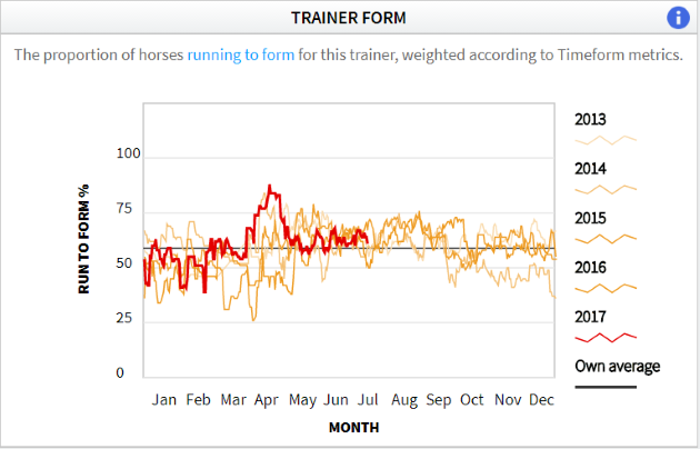
Where the Riding Style Radar sits on the jockey dashboard, for the trainer it’s a cultivated and cutting-edge representation of the performance of the string through the year, from January on the Flat and May over jumps.
The standard means of assessing the form of a stable, of tallying wins and strike-rates, does only a superficial job of flagging up when a trainer is openly in or out of form, but the method and mechanics of the same study in the Timeform dashboard puts it in a fresh, new and enlightening perspective.
The work undertaken recently in fine-tuning our run-to-form calculations makes it the most sophisticated measurement available, and it’s the basis of this periodic trainer assessment, the bold line on the graph (in red) charting the potency of the stable through the year so far. But its true relevance comes in the reference points, the straight, grey line representing the ‘normal’ operating level for the yard, based on that year or the previous five if that’s selected in the filter. In addition, by plotting the previous four years in the background, the context is sharper still, also revealing any stage-of-season patterns that can be tracked.
The above trainer form sample, for Brian Meehan, shows just how intuitive this model can be. The stable had only two winners in the first three months of the year, but the direction of the run-to-form curve at the end of March revealed that the string was coming good again, pre-empting the hotter spell (and four successes) that came in April. And that’s the beauty of this approach to trainer analysis: that it informs of when a yard is turning the corner, one way or another, in trend terms, as opposed to registering an upturn after the fact, when the market is likewise more sensitive to it.

Click on any jockey or trainer in a Race Passes racecard view, then on the ‘unlock’ banner to buy premium data for 50p
FORM ON GROUND/OVER DISTANCE

The information on the dashboard components for trip and ground, available for both trainers and jockeys, highlight any statistical slant to do with conditions, again with the average shown for context. The three ground categories are the same for Flat and National Hunt, but obviously the distance differs to reflect the distinctive perimeters for both disciplines, though the rationale is the same, as is the calculation, using Timeform’s updated run-to-form metric for the most accurate barometer.
The above example, a recent snapshot of trainer Mark Johnston’s dashboard data, illustrates what can be gleaned from the ground and distance displays, in this case that the stable’s runners tend to perform so much better on a faster surface, compared to the other end of the spectrum on soft and heavy. Also, in trip terms, it’s notable how the run-to-form percentage increases in line with the distances of the race.
Each horse is, of course, an individual instance, but forewarned is forearmed, and the ground/distance visualisation acts as a case history for what to expect, and is especially useful for environmental change when a horse is trying something new.
Want to put the Timeform Jockey and Trainer Dashboard to the test for yourself?
Check out these free samples for Ryan Moore, Ruby Walsh, Aidan O'Brien and Willie Mullins

.jpg&w=300)
.jpg&w=300)
.jpg&w=300)

.jpg&w=300)


