


.jpg "Get Timeform ratings for every upcoming runner and past result, plus premium winner-finders including commentary, Flags, Pace Maps and lots more.")


 Url copied to clipboard.

Last week we looked at some relatively new Timeform data, or data that had not been mined for its potential - EPFs (early position figures) - to introduce jockey riding styles, which will hopefully provide some new insights to fans, analysts and punters. This week we look at the same data, but our focus turns to the horses.
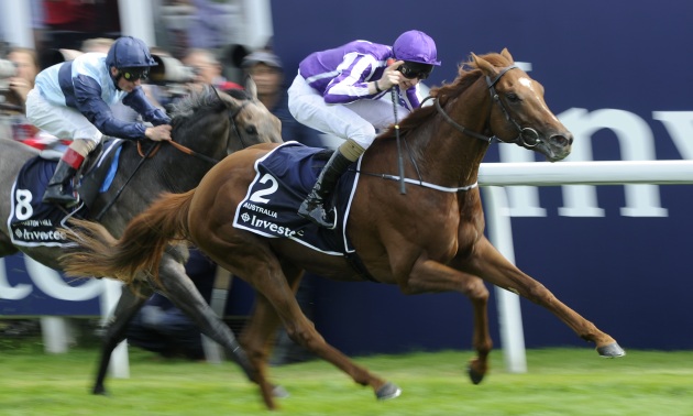
Another important part of pre-race analysis is to try to understand how any given race is likely to be run and which horses are likely to be advantaged or disadvantaged by that scenario, something which was clearly a big part in the thinking of ex-jockey Joseph O’Brien, who recently tweeted some Derby notes he made ahead of the 2014 renewal in which he was riding Australia.
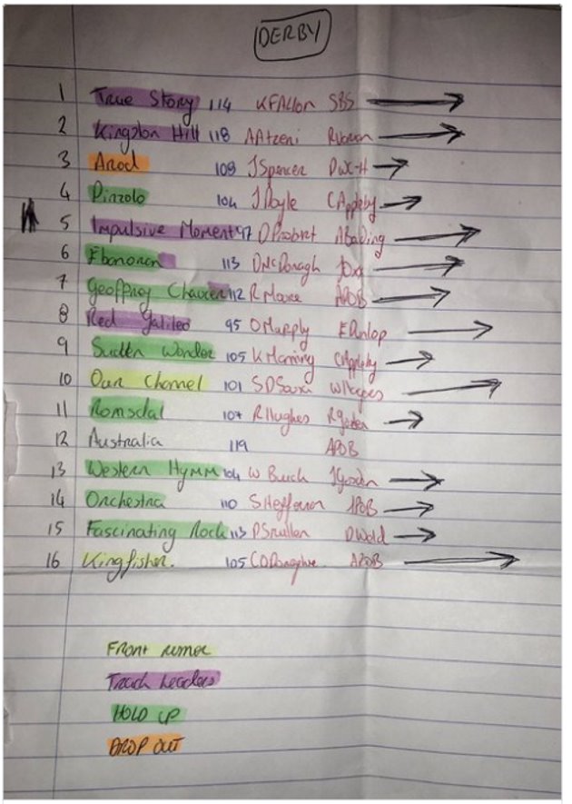
The picture O’Brien shared showed where he expected his 15 rivals to position in the race – he had done his homework.
We don’t know how he arrived at this forecast but, like anyone else, I suspect he watched races of his rivals, noting their positions in those races and then used that research to inform his view of the Derby. If he was a Timeform customer then he could have combined his knowledge with Timeform’s EPFs to forecast the 2014 Derby.
As EPFs can be used to establish jockey riding styles, they can also be used to try establish the run style of a horse. Unfortunately, unlike jockeys who can build up a large dataset of rides quite quickly, horses will have far fewer performances for us to work with. Nevertheless, having small amounts of data is better than having no data (although no data – i.e. no past performances – is useful information, too, as we’ll see).
Using a horse’s historic EPF performances we can establish rough probabilities for where the horse tends to be positioned in its races. We can update these probabilities given other factors; a horse’s last two EPF performances (increased weighting on recent performances), jockey, draw, fitness (days since their last run) and a number of other factors.
We’ll now discuss some of the data used in updating the probabilities, starting with previous performance EPFs.
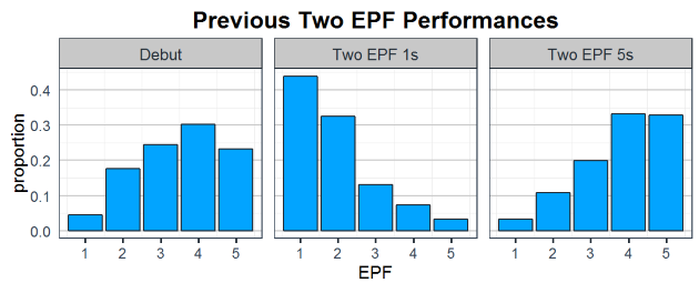
The left plot shows EPFs recorded by debutants (so actually no previous performance data). It can be seen that a very small proportion lead on debut, while the most common EPF of a newcomer is 4 (0.30 of debuts). The middle and right plots show where horses tend to be on their third run if their previous two outings had resulted in EPFs of 1 and 5 respectively. What you can hopefully see is that these horses rarely go from leading to held up and vice versa, i.e. they tend to race in a similar position.
In a previous article, we showed how jockeys performed on horses compared to their predicted EPF. If Richard Kingscote and Ted Durcan are riding a predicted front runner, we can be confident that Kingscote will, more often than not, position the horse towards the front, whereas Durcan very rarely leads, so we can also update our expectations given this information.
One of the other biggest factors that impacts a horse's chance of running where they might be expected to are the other horses in the race. Therefore, any forecast must also take into account the rest of the field. There may be two front runners in the race, but one is more likely to lead than the other. This updating of probabilities given new data (factors), is done repeatedly, always taking into account the other runners in the race.
The result of all this can be seen in the Pace Map for the 2016 Derby, with Port Douglas pulled out as an example.
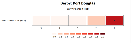
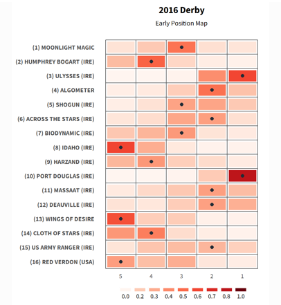
The five tiles correspond to the 5 possible EPFs that a horse can record in a race.
EPF 1 (right most tile) is leading, EPF 5 (left most) is held up. The colour scale represents the probability of the horse recording that EPF; deeper reds are higher probability, while white represents lower probability. The black point is the most likely EPF (the tile with the deepest red). So, with our example you can see that Port Douglas was predicted to record an EPF of 1 – which he duly did. Port Douglas was an easy horse to predict, admittedly, given he had led or raced prominently in his last four starts, and it's clearly much harder for jockeys to put pre-race expectations into practice given how much can happen in the first 50 yards let alone the first and second furlongs, but armed with a Pace Map you can take a lot of the guesswork out of how a race is likely to be run.
The Timeform Pace Map is currently in the final stages of being added to our products, but to whet your appetite and to help with your punting at Royal Ascot we’ll be showcasing them for some of the bigger races on Twitter.
Click to follow Timeform on Twitter


.jpeg&w=300)
_(1).jpg&w=300)
_(1).jpg&w=300)

.jpg&w=300)


